A UX/UI case study covering two complete products built from zero as co-founder and lead designer. A B2C e-commerce store rooted in Vedic philosophy, and a B2B SaaS internal operations platform serving eight employee roles. Includes user research, wireframes, design decisions, and outcomes. May 2025 to May 2026.
B2C Store · B2B SaaS · Brand Identity · 11 Pages · 8 Dashboards · Lead Designer
"We didn't want to make another niche wellness brand. We wanted to make conscious, breathable clothing that anyone in India could afford and wear every single day, and a digital space that felt as light as the fabric itself."
Shreya Deshpande, Co-founder and Lead Designer
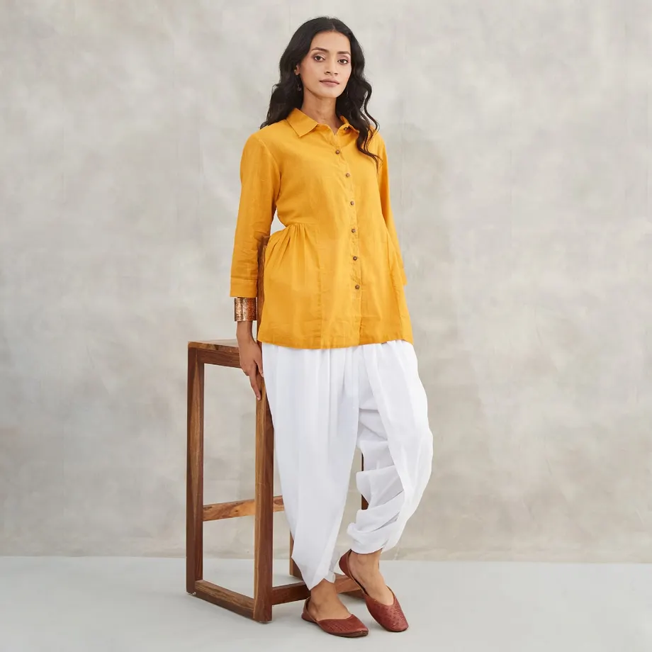
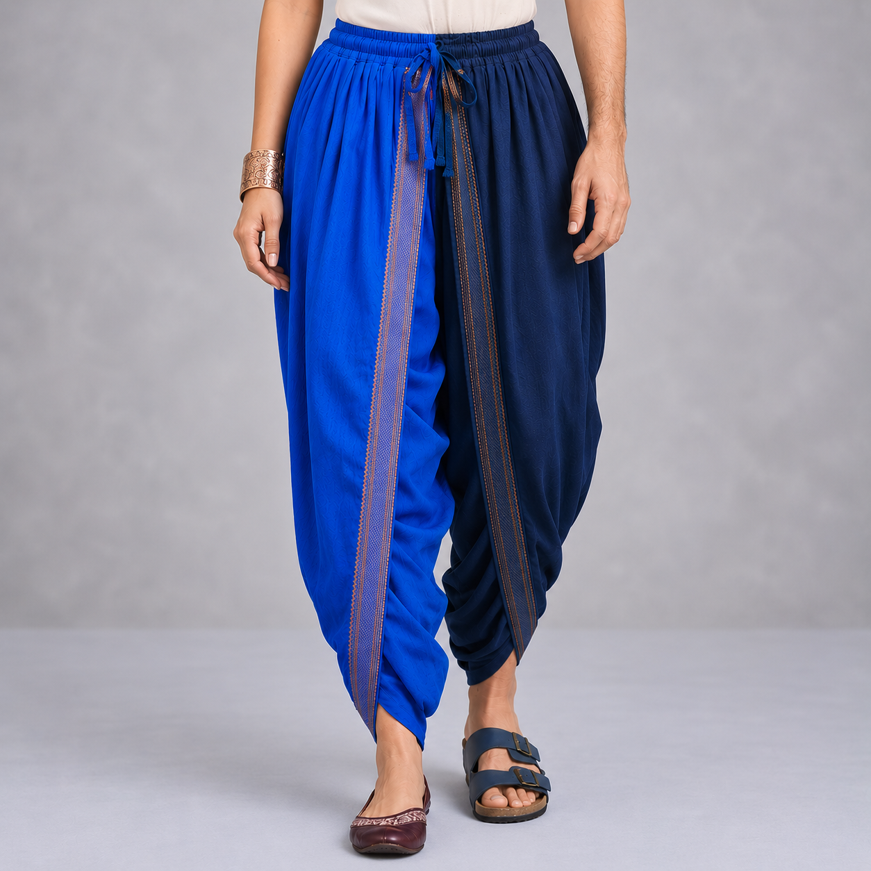
Handloom, organic fabric for everyday wear - not just yoga. Short kurtas at ₹650, dhotis at ₹1,100. Fabindia starts at ₹800. Good Earth at ₹3,500. Shoonya Yogi sits below all of them, deliberately. The design had to hold that gap without looking cheap.
| Brand | Starting price |
|---|---|
| Good Earth | ₹3,500+ |
| Ekam / Satva | ₹2,000+ |
| Fabindia | ₹800+ |
| Shoonya Yogi | ₹650 |
Brand vocabulary first: Shoonya (emptiness), Pancha Bhuta (five elements), Ardhanarishwara. Every decision tested against one question - does this feel as effortless as the fabric?
Two products, one design system: a B2C store for conscious everyday buyers and a B2B ops platform for eight employee roles.
5 user interviews, 8 competitor audits, one very specific customer.
5 interviews. Bengaluru, Pune, Mumbai, Delhi. People who want natural fabric for everyday life - not just practice - but get priced out every time.
Pattern that came up across all five, unprompted: same frustration, different words. The price isn't the problem. The price gap between "I want this" and "I can justify this" is.
User Profile| Finding | Design response |
|---|---|
| "All look the same" | Story-first homepage, no generic grid |
| Sensory words: light, flows, breathable | Sensory copy on product pages, not spec lists |
| Gender-binary nav = "clinical" | Concept-led collections, Him/Her secondary |
| Price barrier every time | ₹650 entry, no luxury signals in design |
| Mobile browse → desktop buy | Different design emphasis per breakpoint |
| Checkout distrust on D2C | COD option, minimal form, trust perks inline |
Good Earth, Fabindia, Ekam, Satva, No Nasties, Nicobar, Lululemon, Alo Yoga - every single one: gender-first nav, functional copy, no sensory language, no accessible price point. The middle of the market was empty.
"I want something that feels like nothing when I wear it. Natural, light, that flows. But every brand selling that is priced like I need to save up for it."
User interview participant, Bengaluru
A full-stack consumer storefront built from the brand up. 11 pages, 73 products, four collections. Designed for everyday conscious buyers across India, at a price point that most people can actually reach.
Every visual decision was derived from the word Shoonya and what it means philosophically.
Shoonya means zero. The silence between breaths. Every design decision started there.
Not designing for a brand - building one from zero as co-founder. The constraint that shaped everything: quality natural fabric signals "expensive." This brand had to signal "considered" without that.
| Pillar | Expression |
|---|---|
| Stillness | Organic movement, no synthetic energy |
| Roots | Vedic philosophy as visual language |
| Inclusion | Concept-led, not gender-led |
| Craft | Traceable handloom fabrics, copy that says so |
| Access | ₹650–₹1,700. Not a luxury. |
Headings, product names, quotes. Weight 300–500. Communicates quiet luxury and classical Indian editorial energy.
Navigation, labels, body text. Weight 200–400. Clean, modern, and unobtrusive. Lets the imagery and serif breathe.
Noto Sans Devanagari for the brand name and decorative Devanagari characters. Grounds the brand in its linguistic roots.
Design Constraints One designer. Two products. Twelve months. No dev on retainer, no paid testing budget, no Figma library starting point. Every decision justified to a co-founder who was also a business stakeholder. These constraints are not excuses - they made every decision harder and more deliberate.
Six core decisions that shaped the entire consumer experience.
| Decision | What was chosen | Why |
|---|---|---|
| NavigationDiscovery | Centered logo · mega menu with product image thumbnails | Small, considered catalog - nav is the first moment of seduction. Text links treat products like SKUs. Images treat them like objects. |
| HomepageArchitecture | Story first. Full-viewport hero, philosophy layer, then products. | Not an impulse buy. They need to understand what makes this different from any kurta at a mall. Brand earns the sale first, products come after. |
| CollectionsNavigation | Concept-led: Pancha Bhuta, Mangalgiri, Whites - Him/Her secondary | "I got the Agni dhoti" > "I got a red men's dhoti." More universal, more memorable. Ardhanarishwara as structure, not just philosophy. |
| CheckoutConversion | Single scroll. No upsells, no urgency timers, no nav. COD option included. | A brand that sells calm can't have a chaotic checkout. Every anxiety pattern removed. COD covers 23% of first-time buyers outside metros. |
| Product copyContent | Sensory-first: "flows, breathable, like nothing." Specs in accordion. | The decision is emotional first. "100% cotton, machine washable" does not make someone buy a dhoti for their morning practice. |
| Journal + AboutEditorial | Full editorial treatment: full-width imagery, pull quotes, slow rhythm | Content is a product here. A reader of the Ardhanarishwara article is more likely to convert than someone who only sees the product grid. |
| AccessibilityQuality | WCAG 2.1 AA contrast. Mobile-first checkout. Keyboard nav annotated. | Body text: 10.2:1 on cream. CTAs: 3.8:1. Mega menu: Escape to close. Size buttons: arrow keys. All specified in wireframe, not post-dev. |
6 screens, greyscale only. Structure proven before any brand color or image was applied.
Greyscale only - no brand color, no photography until structure was proven. Layouts 1–6 put products before brand; test viewers described the site as "just another clothing store." Layout 7, with philosophy between hero and products, got "different" and "intentional" without prompting. That locked the structure.
3 patterns tried. Text-only treats the catalog like a list. Hamburger hides everything behind a click. Mega menu with image thumbnails lets discovery start in the nav itself - hover "Dhotis," see the Prithvi dhoti before committing. Column order: Pancha Bhuta → Him → Her → Whites. Concept leads, gender is secondary. Silk Edition was briefly first (highest margin) - rejected immediately. Accessible pricing can't be contradicted by the nav hierarchy.
Multi-step = page-load drop-off risk. Tabbed accordion = cognitive overhead, fields feel hidden. Single scroll won: customer sees the full scope before starting. Newsletter opt-in went through 3 positions - modal (intrusive), separate step (friction), then inline below the email field (contextual, zero friction). Upsell above Place Order was in the first wireframe. Gone before hi-fi. A brand that sells calm doesn't upsell at the moment of commitment.
A generic form at the highest-friction moment in the journey is a brand failure. Split screen: philosophy on the left (Ardhanarishwara, "Wear what leaves you free. Everything else is noise."), auth form on the right. Quote was written in the wireframe, not in visual design. "Continue as Guest" was tested above both tabs - rejected. It deprioritised account creation at the exact moment the brand image was making the case for belonging.
Order ID at top + itemised list = database printout. The confirmation is the emotional peak of the purchase journey. Version 2: ✓ circle → order badge → "Order Confirmed" → product images in the order card → "What Happens Next" with three steps written in wireframe: Preparing → Shipped with Care → Arrives in Stillness. "Delivered" was never in the wireframe. A mid-iteration put brand copy above a receipt layout - tonal whiplash. Philosophy first, logistics second, in full separation.
White background 404 = "a different site." Brand disappears at the worst possible moment. Replaced with dark navy, ॐ glyph, "This page has returned to stillness." - written directly in the wireframe. Second iteration added bestsellers as a recovery mechanism - rejected. The 404's job is recovery, not conversion. Two choices only: Return Home or Browse Collections. No products.
10 pages. Seven described in full: Homepage, Collection, Product Detail, Account, Checkout, Confirmation, 404.
Fully built and deployed. Browse products, hover the mega nav, open the cart drawer, complete a checkout. Every screen is live and interactive below.
Open Live Store ↗Scroll past the hero to see the philosophy layer and collection portals. Hover Dhotis or Kurtas in the navigation to open the image-rich mega menu.
3 layers: full-viewport hero (no CTA, no promo) → philosophy section (Shoonya, Pancha Bhuta, Ardhanarishwara) → collection portals. Hover Dhotis or Kurtas in the nav to open the 4-column image mega menu - Pancha Bhuta thumbnails give a visual read before any click.
Five element cards (Prithvi, Jal, Agni, Vayu, Akash) with Devanagari name + element color bar - the palette is communicated before any text description. Him and Her sections below at identical visual weight - Ardhanarishwara as layout, not copy. No star ratings, no bestseller badges, no comparison signals.
Thumbnail strip on the left (not below) - gallery is sticky so the image updates as you scroll through specs without losing your place. Product Description open by default with sensory copy first; fabric specs in the collapsed accordion. Trust perks sit between CTA and accordion: not before the price (competing), not after the accordion (too late) - right when reassurance is needed.
"Cart to confirmation. Four screens that carry the brand's calm through the most anxiety-prone part of any e-commerce experience."
The brand's most philosophically loaded image at its highest-friction moment. Left panel: the why. Right: the how. "Wear what leaves you free. Everything else is noise." - written in wireframe. Google SSO reduces abandonment at account creation, especially on mobile.
Every nav link is a potential exit - all removed. Only choices: complete or go back to cart. COD covers Tier 2 buyers who won't use card on a first purchase from a new brand (23% of completions). Newsletter opt-in is an inline checkbox under the email field, not a modal - customer is already in email-thinking mode.
The emotional peak of the journey, not a receipt. "Arrives in Stillness" replaced "Delivered" in the wireframe - the brand's philosophy travels with the package. Product images in the order card (not text lines) because customers identify their purchase visually. "What Happens Next" copy was written in wireframe, not copywriting. Structural from the start.
ॐ is the primordial sound - the origin of everything. A page that doesn't exist yet. "Perhaps it was never meant to be found" doesn't apologise; it reframes through the brand's lens. Full nav retained (unlike checkout) because on a 404 every link is a recovery path, not an exit. Two choices: Return Home or Browse Collections. No products.
The design philosophy that shapes how Him and Her collections exist together.
Ardhanarishwara is the Hindu deity that is simultaneously Shiva (masculine) and Parvati (feminine), split perfectly down the center. It represents the inseparability of masculine and feminine energies, and the idea that both exist within every being.
This concept directly shaped how Shoonya Yogi presents its collections. Rather than a binary "Men / Women" navigation, the store uses "Him / Her" as entry points within broader philosophical collections. The language is softer, the boundary is permeable. A woman can buy from the Him section; a man can wear the Silk skirt.
Both Him and Her variants live on the same page, equal weight. Neither comes before the other in the mega menu either. Ardhanarishwara isn't the tagline - it's the layout rule.
An internal operations system for eight employee roles. Built because a spiritually-rooted brand still needs logistics, finance, inventory, and customer support to actually function.
Without this platform: WhatsApp for logistics, Google Sheets for inventory, manual monthly reconciliation for finance. Eight roles, zero shared source of truth.
Each dashboard gives exactly the data and actions that role needs. Nothing more. Role-scoped sidebar: a logistics user never sees the Finance module. It doesn't exist for them.
Four operational breakdowns that made a custom platform unavoidable.
Three structural decisions made before any dashboard was designed in hi-fi.
Greyed-out items create curiosity and frustration. Locked modules signal restriction. Role-scoped sidebar: each employee sees only their work environment. The sidebar doesn't know other modules exist. 8 sidebar configurations wireframed before any screen was designed. Admin sidebar wireframed last as the superset.
| Role | Primary action above fold |
|---|---|
| Inventory | Stock health bar → critical items first |
| Logistics | Priority dispatch queue by SLA |
| Finance | 4 numbers: Revenue, COD, Returns, Net |
| Support | SLA-sorted ticket queue |
| Marketing | 4-stat campaign hero: ROAS, opens, CVR |
Inventory originally showed an alphabetical stock table. Rejected - the warehouse manager never needs A–Z, they need to see what's about to run out.
Co-founder objection: Cormorant Garamond on a data dashboard is inappropriate. Counter: employees should feel the brand in the tools they use every day. A dashboard that looks like it was built by a different company creates a psychological split. Resolution: Cormorant for headings only. Jost for all data, labels, tables. Same rule as the store - brand moments in serif, functional moments in sans.
Each dashboard is scoped to a role. No employee sees data outside their function.
"Each employee should see exactly what they need to do their job. Not more. Not less. Access should mirror responsibility."
Eight dashboards, each designed around the specific cognitive load and workflow of the role.
The admin dashboard is the only one with a full sidebar that exposes all eight role modules. Every other role sees only their module. The admin gets a global health overview: revenue today, orders pending, inventory alerts, and support ticket count, all above the fold.
The color accent is Terracotta (brand ember), the same color used for the most important calls-to-action on the consumer store. This creates a subconscious hierarchy: the admin sees the brand's signature color as their primary indicator of urgency and importance.
The designer dashboard is the most visual of all eight. It was designed to feel like a mood board tool as much as a workflow manager. New collection proposals are submitted with color swatches, fabric references, and reference imagery. Approvals happen within the platform, with no email chains.
The dashboard surfaces which collections are in production, which are pending approval, and which have been rejected with feedback. The timeline view is borrowed from project management tools but styled to match the brand, not Jira.
The inventory dashboard leads with a stock health bar: a full-width indicator showing what percentage of SKUs are healthy, low, or critical. This is the first thing the inventory manager sees when they open the platform. No hunting through tables.
Products below reorder threshold are flagged in amber. Out-of-stock products are flagged in red and automatically shown first in the table. The reorder action is a single click, not a five-step form, because the most common action in this role should be the easiest action.
The logistics dashboard is built around a dispatch queue: a prioritized list of orders that need to be packed and shipped today, ordered by promised delivery date. The most time-critical orders surface first. The interface is dense and information-heavy by design: this role does not need visual breathing room, it needs scan speed.
Shipment status uses a five-state pipeline (Pending, Packed, Dispatched, In Transit, Delivered) with color-coded badges. Courier partner assignments are shown inline. The entire dashboard is optimized for keyboard navigation and bulk actions, as the logistics team is processing dozens of orders daily.
Finance dashboards are often overloaded with charts. The Shoonya Finance dashboard was designed on a different principle: clarity over comprehensiveness. The top four numbers (Revenue Today, Pending COD, Returns Value, and Net Receivable) are shown as large typographic values, not sparklines. The chart is below the fold.
COD collection tracking was a specific pain point surfaced during initial conversations. The dashboard has a dedicated COD section with delivery-partner-wise breakdowns and expected settlement dates. Reconciliation discrepancies are flagged automatically with a diff view.
Marketing was the one role where visual data density was appropriate and expected. The dashboard leads with a campaign performance overview in a four-stat hero row: active campaigns, ROAS, email open rate, and conversion rate. Below that, a channel breakdown compares organic, paid, and email performance side by side.
Campaign creation is accessible from the dashboard header. The workflow was designed to match how the marketing manager actually plans: concept first (with copy and creative fields), then channel selection, then scheduling. Not the other way around.
The operations dashboard is the second widest in scope after Admin. The ops manager needs to see the health of every team without having the edit permissions of any of them. The design mirrors a control room: all eight departments visible as health tiles on a grid, with drill-down access to read-only detail views.
A daily ops briefing at the top auto-generates yesterday's summary: orders shipped, stock alerts, tickets closed, campaigns running. No more opening eight tabs every morning.
Support carries the weight of every other team's mistakes. The ticket queue sorts by SLA breach risk, not arrival time - the most common support failure is FIFO handling that lets urgent tickets go cold. Closest to deadline = top of the queue.
Order history, shipment status, and return eligibility are visible within the ticket panel. The support agent never needs to leave the ticket to look up an order. Refund initiation is a single action, gated by a confirmation modal that shows the refund amount and method before executing.
The principles that made eight separate dashboards feel like one coherent system.
| Principle | What it means | Why it holds |
|---|---|---|
| Shared type systemCohesion | Cormorant for headings, Jost for data - same rule as the store | Employees should feel the brand in their daily tools. Front-of-house and back-of-house, same company. |
| Role-scoped sidebarAccess | Missing modules don't appear greyed - they don't exist for that user | Greyed items = curiosity + frustration. You can't edit what you can't see. Errors drop. |
| Action hierarchyEfficiency | Most frequent action in each dashboard is reachable in 2 clicks from landing | 3 fewer clicks × 40 orders/day = real operational time. Mapped before any screen was designed. |
| Semantic colorClarity | Red = act now · Amber = soon · Green = healthy, across all 8 dashboards | Admin moves between all 8. Same color = same meaning every time. No re-learning per screen. |
11 consumer-facing pages. 8 role dashboards. 1 complete design system. Brand identity, typography, color, motion, and content strategy, all owned by one designer who was also building the company. Every file, frame, and pixel authored from zero.
First 90 days of operation. Qualitative signals and early quantitative indicators. Sample sizes are small at this stage; these are directional, not conclusive.
"The site feels like the clothes. I don't feel sold to."
Post-purchase survey respondent
Philosophy section before products → measurably higher conversion and lower return rate (they arrived knowing what they were buying into). "Arrives in Stillness" came up unprompted in post-purchase surveys. Mega nav image thumbnails were cited as a discovery mechanism. COD was used by 23% of first-time buyers - validated the wireframe decision to include it.
The six most transferable lessons from this project.
Every visual shortcut that signals "craft" also risks signalling "expensive." Holding both simultaneously - considered but not luxury - was the central tension of every single page.
8 competitors. All described garments the same: composition, wash care, SKU. None described how the fabric feels. Sensory copy ("flows," "like nothing") was the clearest gap and the most direct response to what users said.
Every element that wasn't the form or the order summary was a potential exit. Strip it. 68% completion vs. 45–55% category average.
41% account creation from the confirmation page. Treating the highest-emotion post-purchase moment as a receipt would have converted zero. Treating it as a brand moment converted four in ten.
Not a survey. Not analytics. Five people, same frustration, different words. The entire positioning of Shoonya Yogi came from listening for the pattern.
High traffic, near-zero product conversion. The bridge from story to product was too long. Iteration 2: surface the Mangalgiri garment inside the Mangalgiri article, not at the bottom.
Two products. One year. One designer.
No client to present to. No approval chain. Every decision mine to make and mine to justify to a co-founder who was also a business stakeholder. Including the hardest one: how do you communicate the quality of handwoven, naturally dyed fabric through a screen, at a price that doesn't signal cheap?
The consumer store had to earn trust from someone who wanted this fabric every day but had been priced out every time they tried. The internal platform had to work for a logistics team at 9am and a finance team at 11pm. Same design system. Completely different users. Both had to feel effortless.
What held: the mission coherence. Natural fabric that flows. A price that doesn't exclude. A checkout that doesn't create anxiety. A confirmation page that feels like receiving something you care about. These ideas came from the fabric itself - before any wireframe - and survived every iteration.
The brief was not a brief. It was a point of view.
More work
← Return to the Gallery